Responsive website design/layout
What you'll learn to do in this page
- Create responsive layouts using column widths
- Add responnsive images to website content
Modern websites use responsive design as a method to allow site visitors using various devices (phones, tablets, desktops) to view website content specifically tailored to their device. Townsquare uses a framework developed by Twitter called Bootstrap that gives many features for responsive website development.
Creating Responsive Layouts
The Bootstrap menu in the content editor gives site administrator the tools necessary to create layouts based off a grid system. Grid systems are used for creating page layouts through a series of rows and columns that house your content. Bootstrap includes a responsive, mobile first fluid grid system that scales up to 12 columns as the device or viewport size increases. As an example, if you'd like to create three equal columns in your layout, you would create columns that have a width of 4, which would equal 12 when you have three columns next to each other. Below is an example of this principal:
Column 1
Lorem ipsum dolor sit amet, consectetur adipiscing elit. Duarum enim vitarum nobis erunt instituta capienda. Cur tantas regiones barbarorum pedibus obiit, tot maria transmisit? Quod quidem iam fit etiam in Academia. Duo Reges: constructio interrete
Column 2

Column 3
Lorem ipsum dolor sit amet, consectetur adipiscing elit. Duarum enim vitarum nobis erunt instituta capienda. Cur tantas regiones barbarorum pedibus obiit, tot maria transmisit? Quod quidem iam fit etiam in Academia. Duo Reges: constructio interrete
Should you wish to create two equal column widths in your layout, you would create columns that have a width of 6, which would equal 12 when you have two next to each other. Below is a visual example:
Column 1
Lorem ipsum dolor sit amet, consectetur adipiscing elit. Duarum enim vitarum nobis erunt instituta capienda. Cur tantas regiones barbarorum pedibus obiit, tot maria transmisit? Quod quidem iam fit etiam in Academia. Duo Reges: constructio interrete
Column 2
Nice, right? Besides having the ability to create multi-column layouts in your content, these columns 'stack' when viewed on a mobile device. To test, grab the right side of your website browser window and drag to the left to emulate what tablets and mobile phones display, like the animation to the right.

To create various column layouts in your pages, use the 'Insert Bootstrap row at cursor' button ( ). When you click the dropdown you will see a variety of options for columns and rows:
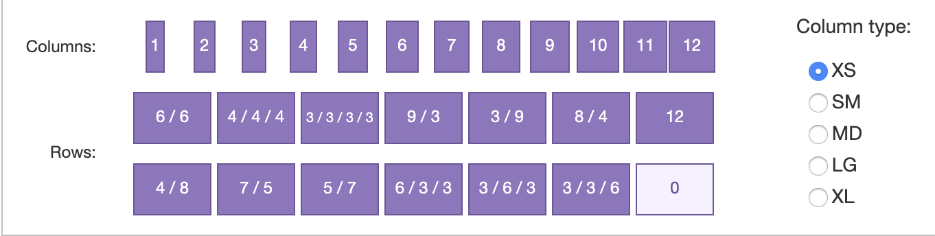
To insert a single column of a particular width, use the 'Columns' section and choose the appropriate width you'd like to use. More often than not, the 'Rows' option will make it easier to create layouts, especially layouts that have multiple columns. You'll notice in the image above that a variety of layouts are available, you simply need to choose the option you would like to use. When a row is created, you will notice that placeholder text is added to the columns and rows that indicates the width of the column. Highlight and delete this text carefully, because you may inadvertently delete the column containers (the light blue box within the red box).
The 'Column type:' field in the right side of this dropdown indicates the breakpoint where this row should start. By default, the 'XS' column type is checked as Bootstrap is a mobile-first framework. This option should be changed to MD so that mobile devices don't display multiple columns as those devices are too small to display multiple columns.
For reference, the column type breakpoints relate to these devices:
XS - Mobile phones
SM - Larger phones
MD - Tablets (iPad and similar)
LG - Tablets (IPad pro and similar) and smaller laptops
XL - Desktop computers and larger laptops
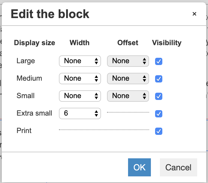
Once your columns have been created site administrators also have the ability to adjust column widths. To do so, set your cursor within the column, and click the following icon in the Bootstrap administration tools ( ). When clicked, a popup will display that looks like the screenshot to the right:
This popup window allows site administrators to edit the block. In the example to the right, the block will display as a 6-column (half width) on extra small screens. On small screens to large screens the width will stay at half width as the width of the mobile carries all the way up through large, unless specified otherwise.
The second example on the right shows a block that has a 12-column width on XS screens and a 6-column width on SM screens all the way through large screens. This is ideal when half-width columns are desired for every screen size except XS screens.
Also note that you have the options to offset columns in the 'Offset' column. Offsetting columns allows site administrators to 'push' columns to the right a specified column width. Please note that with offsetting columns you may push columns on the right to the next line as the offset will add more column widths to a row. Thus, if you have two 4-column widths, you can offset the first column up to 4-columns as that is still less than 12.
You also have the option to toggle visibility of blocks. on various devices. Simply uncheck the visibility checkbox next to the display size that you would like to hide and that block should not display on that breakpoint. You can test by scaling your browser window down and see if that block displays.
Example 1: half width on all screens

Example 2: full width on XS, half width on all other screens
Adding Responsive Images to Content
When creating content that is responsive to multiple devices it is important to remember that images added to content are not responsive by default. To make images responsive, hightlight the image and choose the 'Responsive image' dropdown under Formats to ensure the image scales appropriately. Please note that the format options you may see on your Townsquare site may not look like the formats displayed on the screenshot to the right.
Once you have added the responsive image format to an image, you can test the image responsiveness by scaling the size of your browser window and see if the image scales down proportionately.
